SquareMotionArt
Document · BG · 001
Edition 02 · May 2026
For internal & partner use
— Live Painting Performance
Brand Guidelines
— One time, one meeting.
ブランドガイドライン
Ichigo Ichie is a non-profit live painting project built around a single Japanese idea — that every moment, and every meeting, is unrepeatable.
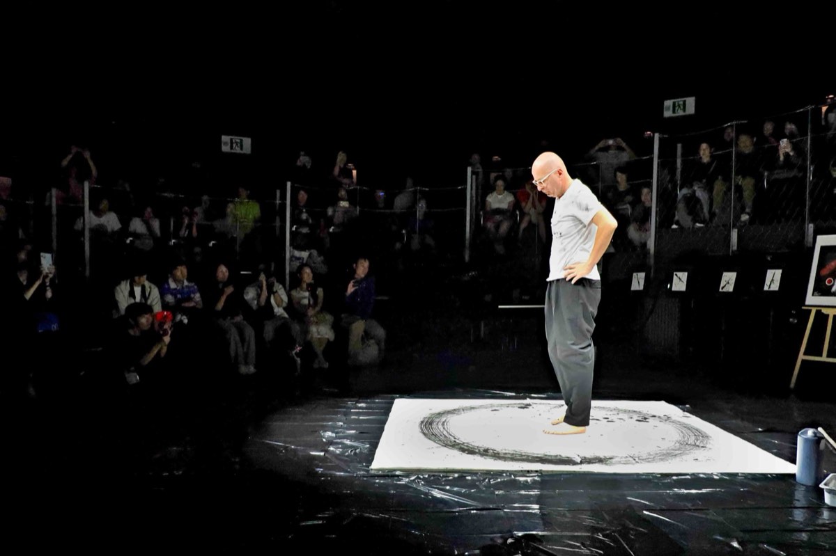
We host live painting performances in temples, schools, galleries, festivals and community spaces. A large-scale sumi-ink artwork is created in real time, in front of a quiet audience. After roughly twenty-five minutes the work is gently torn into many fragments, and each person present takes a piece home. 私たちは、寺院、学校、ギャラリー、祭り、地域の場でライブペインティングを行います。
Presence over performance. Stillness over spectacle. Connection over content. Contrast — black against white, motion against stillness, East against West — is the visual and emotional grammar of the brand.
People who want to slow down. Audiences who never thought of themselves as "art people." Venues and partners who want to offer their community a quiet, dignified moment that has nothing to sell.
One hundred Ichigo Ichie Live Painting Performances around the world in 2026 — and many more beyond, wherever the circle is invited.
The brand has three concentric layers of identity. The outer is the parent studio; the middle is the project; the inner is the performance itself. When in doubt, use the inner.
The English form is two words: Ichigo Ichie. Capitalise both. Never hyphenate. The Japanese form, when used alongside, is 一期一会 — set in Noto Sans JP for body text, or the brushed artwork inside the logo. In running prose the phrase may be italicised as a borrowed term — ichigo ichie — when used as a concept rather than a brand name.
When the project travels into a fully Japanese context, the full title is 一期一会 ライブペインティング・パフォーマンス.
The Ichigo Ichie mark is a single composition with three elements: the two-line stacked wordmark set in Montserrat ExtraBold (ICHIGO over ICHIE), a red O in place of the final letter of "ICHIGO" — drawn as a red ring (hanko-stamp circle) — and the four brush-painted kanji 一期一会 in a 2×2 grid beside "ICHIE." All three elements appear together — never the wordmark alone, never the kanji alone, never the red O as a standalone mark.
The logo's natural home is on black. The performance backdrop, the existing identity, and the painting itself all live there. Inverted (black on white) and statement (all-white on red) variants exist for moments when context demands them — but black is the default surface.
The O at the end of "ICHIGO" is rendered as a solid red ring — a hanko-stamp circle — never as a black or white letter. The O reads as a tiny instance of the larger ring motif, the brand's central symbol embedded inside its own name. This is the most distinctive detail of the lockup and must be preserved at every scale where the lockup is legible.
Two exceptions: (a) when the lockup sits on a red background, the red O loses its colour and the entire word "ICHIGO" is rendered in white — red on red doesn't read. (b) When the lockup is rendered at very small sizes (below 24px / 7mm wordmark height), drop the colour split and use the lockup as a unified silhouette.
The four kanji 一期一会 in the lockup are hand-painted artwork, not typeset. They were brushed in sumi ink to match the visual energy of the live performances. Treat them as an artwork file — when you need them, use the original asset; do not redraw them in a digital Japanese font.
The kanji sit beside "ICHIE" in a 2×2 grid: 一 / 一 on top, 会 / 期 on bottom. They are always white on dark backgrounds, black on light, and never recoloured to red.
Leave at least the height of one letter "I" of clear space on every side of the lockup, free of other elements. The lockup breathes; do not crowd it.
Print: the wordmark no smaller than 24mm wide (full lockup). Screen: no smaller than 80px wide. Below those sizes, use the red O alone as a favicon or stamp.
The palette is intentionally small, intentionally pure. Black, white, red. The same three colours that appear on the performance backdrop, in the painting, in the ring, and on the brand itself. There is no fourth brand colour — only a neutral grey for supporting type.
On any composition, aim for roughly 70% white, 25% black, 5% red. The red should feel earned, never decorative. When in doubt, use less of it.
The brand uses two Latin typefaces — Montserrat for the wordmark and display, Raleway for body copy and secondary headlines — paired with Noto Sans JP for all Japanese running text. Plus one element that is not a typeface at all: the four brush-painted kanji 一期一会 inside the logo, which are hand-drawn artwork. Never introduce a fourth Latin face, and never re-draw the brand kanji.
On all primary brand surfaces (web, posters, programmes, social), when a sentence appears in English it should also be available in Japanese — and the two should sit visually as equals, not parent-and-child. The Japanese sits one line below the English, in the same colour, slightly smaller in optical size. Both languages are first-class citizens.
All three typefaces are open-source and free for any use — print, web, signage, video. Source: fonts.google.com/specimen/Montserrat · /Raleway · /Noto+Sans+JP. No licence fees, no fallbacks needed.
Every image we publish should look as if it was caught — not arranged. The audience seated quietly, the brush mid-stroke, the room half-lit, the ring half-finished, a fragment in a stranger's hands. These are the images that earn the brand.
This is the canonical reference image, used across the website, the backdrop, business cards, and most printed materials. White stage centred in deep black. A single figure. The ring finished, sumi-ink dense, still wet. An audience reduced to silhouette. Match this composition, this density, this light, whenever new photography is commissioned.
Stock photography. Posed portraits with crossed arms. Stylised product shots of the painting on white. Anything that looks like a press kit photograph for someone else.
Ichigo Ichie speaks in a single, calm voice — the voice of someone who has just finished a performance and is sitting down to tell you about it. Never marketing-y, never loud, never urgent. Generous with silence. Comfortable with ellipses.
"A circle of calm, amidst the rush of the world."
"For about twenty-five minutes, the room becomes a sanctuary."
"You are invited to sit. To breathe. To stay."
"One circle becomes many. Each fragment, a memory of a moment that cannot be repeated."
"Don't miss out on this incredible experience!"
"Get your tickets today before they sell out."
"The most immersive art event of 2026."
"Click here to support — your donation makes a difference!"